Aclima measures air quality where people live, work, and spend time with friends and family. Our approach to air quality mapping provides visibility into people’s lived experience of pollution. This new picture of air quality illuminates how pollution impacts people’s health and lives in our communities.
At the Richmond-San Pablo AB 617 steering committee yesterday, we released an interactive report of hyperlocal, average air pollution in Richmond-San Pablo in the SF Bay Area, from August 1 through October 31, 2019, at insights.aclima.io/richmond-san-pablo.
With this freely available online report, community members in Richmond and San Pablo, California can now look up hyperlocal air pollution by address, share the information on social media, and access resources to take action.
How We Measure and Analyze Hyperlocal Air Pollution
In order to support local action to reduce emissions and protect people’s health, we have developed and validated a new way to measure what we refer to as hyperlocal air pollution. Our research with the EPA, UT Austin, EDF, Google, and others has shown that air pollution on one end of a city block can be 5 to 8 times higher than on the other end, day after day. These hyperlocal hotspots can reflect nearby emission sources, or result from local geography like valleys and hills, or structures like buildings or walls enabling the pollution to accumulate and persist.
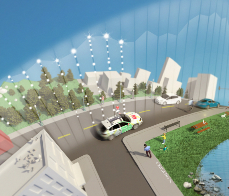
To produce hyperlocal air pollution insights, our mobile sensor network measures key air pollutants like particulate matter and nitrogen dioxide, and greenhouse gases like carbon dioxide at block-by-block resolution. Aclima uses fleets of low-emission cars as a roving sensor network, driven by members of the community. Equipped with our cutting-edge air quality sensing devices, cars continuously collect and map air pollution and greenhouse gas levels as they drive through city streets at different times of the day and different days of the week.
The resulting high-resolution data provides a block-by-block view of air quality that gives people a way to see average pollution concentrations near their home, school, work, and other places they visit regularly. These data points are scientifically verified and converted into interactive maps.
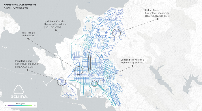
Findings in Richmond-San Pablo
This initial three-month program in Richmond-San Pablo generated more than 110 million data points, measuring fine particulate matter (PM 2.5), Ozone (O₃), nitrogen dioxide (NO₂), carbon monoxide (CO), carbon dioxide (CO₂), and nitric oxide (NO), along with other parameters — all tied to precise locations on a map. Notable findings include:
-
Neighborhoods like Hilltop Green and Point Richmond had lower levels of pollution overall compared with the average over the entire Richmond-San Pablo area.
-
The Iron Triangle neighborhood had higher average NO₂ levels than most of the area. NO2 is formed from burning fuel. Important sources of NO₂ include trucks, trains, and buses, as well as power plants and manufacturing industries.
-
The area southwest of Carlson and Cutting Blvds near Interstate 580 had notably higher average PM 2.5 (which can come from diesel trucks and wood smoke, among other sources) and NO₂ levels. In fact, both pollutants were often elevated near freeways throughout the area.
-
23rd Street between Carlson Blvd and Market St exhibited higher levels of traffic pollutants, including CO and CO₂, both signatures of vehicle exhaust, as well as NO₂. Pollution levels on 23rd street were similar to those measured on other main arterial roads including Cutting Blvd and San Pablo Ave.
Air pollution affects every organ in people’s bodies across every phase of life, and is fueling a climate emergency. Fine particulate matter or PM 2.5 is of the utmost interest to many community members, policymakers, regulators and health officials because it is linked to asthma, lung cancer, and deaths from cardiopulmonary diseases. For this reason, we show hyperlocal PM 2.5 levels first, at the top of the interactive report, for the address entered in the search bar on the left.
The second map in the interactive report is a carousel that shows the weighted average of all pollutants at that address as measured in the study.
This report is part of an ongoing program in which Aclima is mapping hyperlocal air pollution in all nine counties in the Bay Area.
By Melissa Lunden, Chief Scientist, Aclima
Share this
New Research Reveals Hyperlocal Air Pollution Varies Over Space & Time
Aclima and Google Maps Make CGI Commitment to Map Air Pollution in Los Angeles and other California cities with Street View cars